

Cared
Cared
2026
UX Research, Web Design & CRO
Project Overview
When visitors leave before understanding.
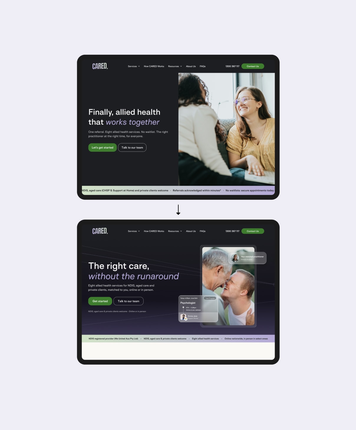
CARED is an allied health service supporting NDIS participants, aged care clients and private clients. I explored how its homepage could better communicate its services, build trust and guide visitors towards taking action.
Early analytics revealed an average engagement time of approximately four seconds, while usability testing suggested visitors struggled to identify what CARED offered, who it was for and what action to take next.
Combining GA4 analysis, five-second testing and a heuristic evaluation, I identified opportunities to improve the homepage's messaging, visual hierarchy and calls to action. These findings informed a redesign focused on making the experience clearer and easier to navigate.
The Evidence
Four seconds to make an impression.
Before making changes, I analysed CARED's existing website performance using Google Analytics 4 (GA4). I explored engagement, scroll behaviour and key conversion events to understand how visitors were interacting with the site and where opportunities for improvement might exist.
Across an initial two-week reporting period, the homepage showed some concerning signals:
~ 4 seconds
average engagement time
10.91%
of views reached 90% scroll depth
4
recorded key events
Source: Initial GA4 analysis. Confirm reporting scope and event totals before publication.
Data note: Filtering for Australian traffic helped separate relevant visitor behaviour from broader international traffic, providing a more useful basis for evaluating the experience.
These numbers raised questions, but they didn't tell the whole story. Low engagement alone couldn't explain why visitors weren't staying longer or taking action.
I needed to understand what people were actually seeing, understanding and experiencing in those first few seconds.
Understanding the Problem
What five seconds revealed.
Analytics showed that visitors weren't engaging with the homepage for long, but the numbers alone couldn't explain why.
To investigate, I conducted five-second tests with five participants. Each person viewed the existing homepage briefly before answering questions about what CARED offered, who it was for and what they remembered.
A pattern emerged: the visuals captured attention, but the message wasn't coming through clearly.

0/4
Confidently identified the service
Participants struggled to explain what CARED actually provided.
“I don't know, maybe mental health.”
Participant 3
0/4
Correctly identified the audience
Participants were unsure whether the services were intended for patients, providers or particular age groups.
“I don't know, healthcare?”
Participant 2, expressing uncertainty about the service
0/4
Fully recalled the CTA label
Some noticed the primary button, but its wording wasn't memorable.
“Get started or something.”
Participant 3, partial recall
4/4
Noticed the image or logo
Visual elements made an impression, but that attention didn't consistently translate into understanding.
“I saw two people on the chair laughing.”
Participant 3, excerpt
Exploratory research with four external participants aged 20–30. I also conducted a separate self-test. These findings are directional and not representative of CARED's wider audience.
01 / Looking beyond first impressions.
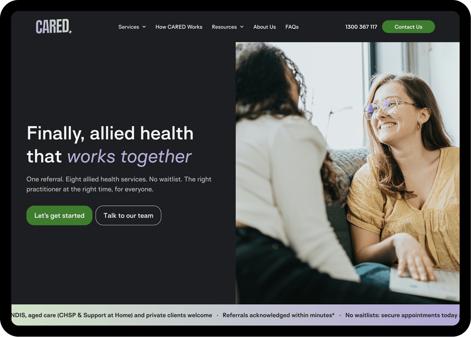
A heuristic evaluation revealed that the challenges extended beyond first impressions. Unfamiliar terminology, competing calls to action and delayed trust signals made it harder for visitors to understand CARED and decide what to do next.

- 01
Competing priorities. The prominent hero image drew attention away from the service message.
- 02
Content clarity. “Allied health” wasn't universally understood.
- 03
Unclear next steps. The navigation and hero presented competing calls to action.
- 04
Trust and reassurance. Important trust signals appeared below the initial viewport.
Design Response
Making the message clearer.
The research gave me a clearer direction: the homepage needed to communicate what CARED offered, who it supported and how visitors could take the next step.
01 / Exploring a clearer first impression.
I explored different approaches to the hero, focusing on clearer messaging, stronger visual hierarchy and imagery that better represented the breadth of CARED's services.
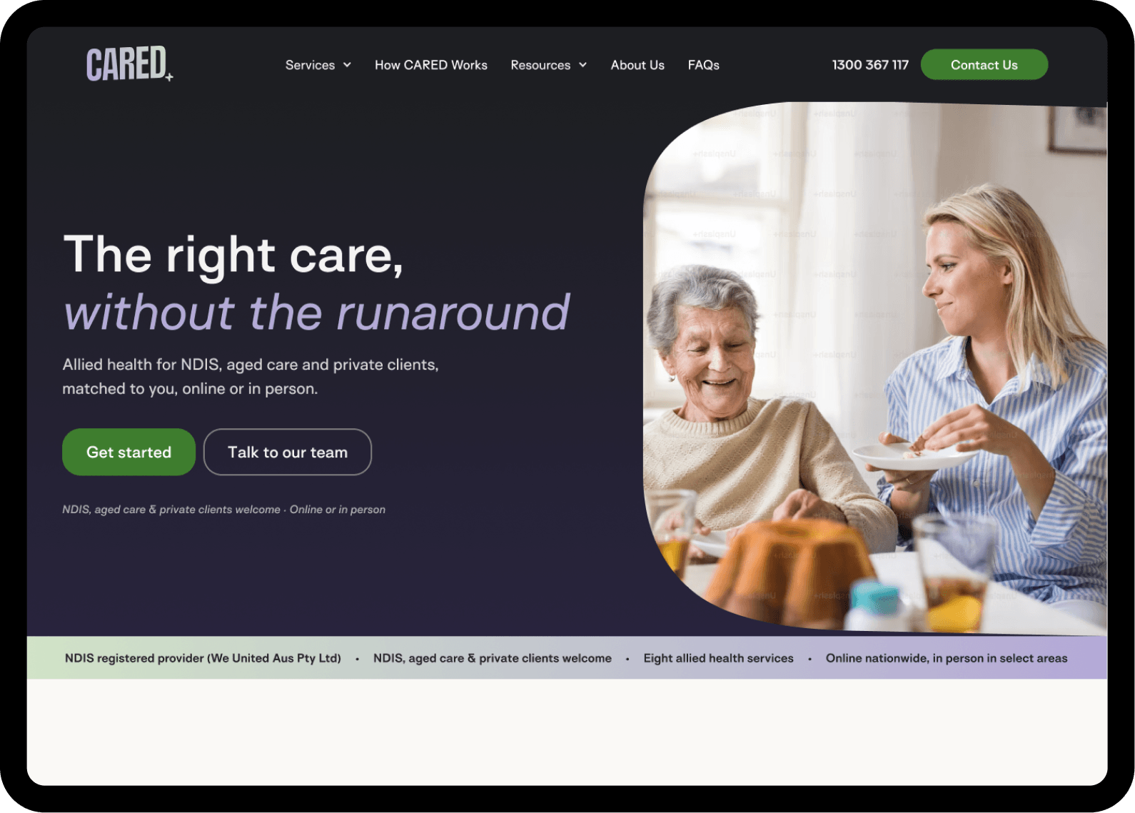
Concept A
Simplified messaging and hierarchy with a single hero image.
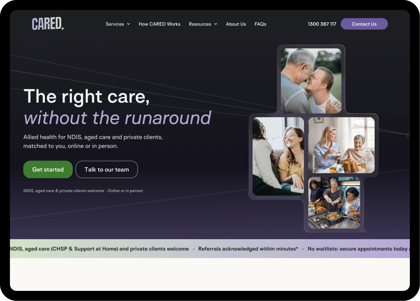
Concept B
Broader imagery and interface details to communicate the range of support.
02 / Three Design Priorities
The research shaped three priorities for the redesign, each focused on making the first impression clearer, easier to navigate and more reassuring.

Speak plainly: Clarify the services and intended audience rather than relying on unfamiliar terminology.
Guide attention: Give the core message and primary action a more intentional visual hierarchy.
Build reassurance: Bring relevant service imagery and verified trust signals closer to the first impression.
The Redesign
Bringing clarity to the first impression.
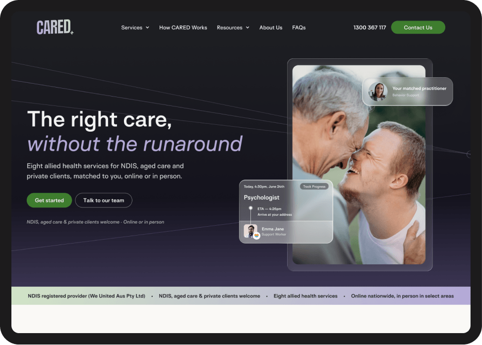
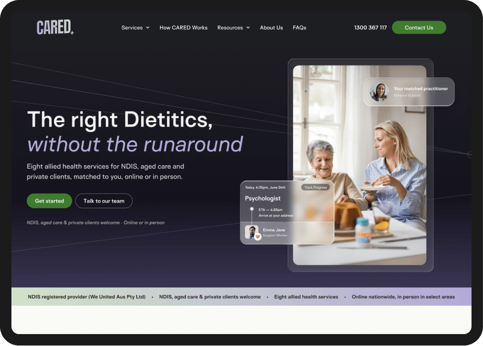
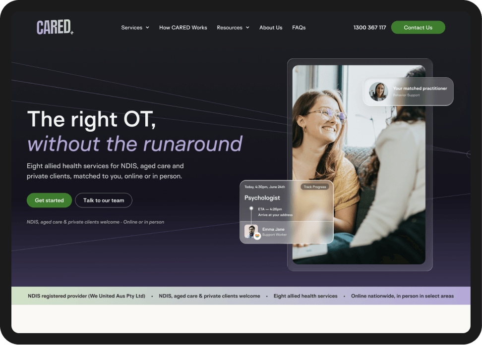
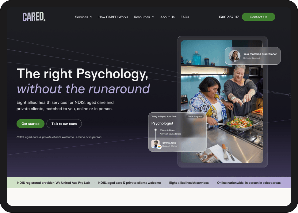
The redesigned homepage brings together the research findings and design explorations into a more focused experience. Clearer service messaging, a more intentional visual hierarchy and supporting imagery work together to help visitors understand what CARED offers and identify their next step.

Less friction, clearer action
Removing “Let's” from the primary CTA makes the action more direct and easier to scan.
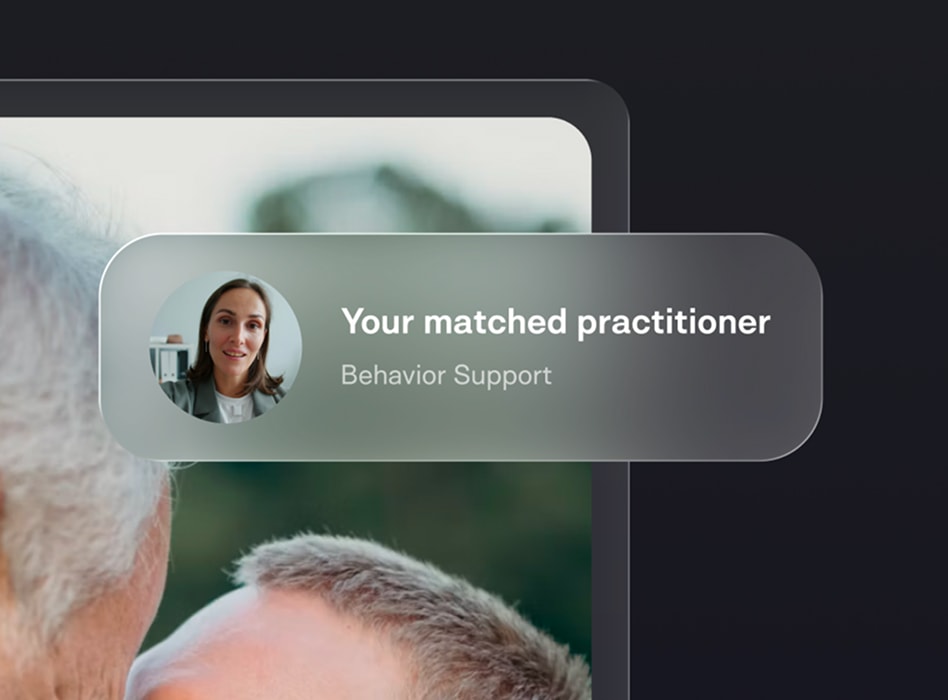
Making care feel tangible.
Practitioner and appointment previews offer visual examples of the support experience, helping visitors picture what happens beyond the first click.
Next Steps
Designed to be measured.
The redesign is awaiting post-launch evaluation. Once live, I'll revisit engagement, scroll depth and conversion data, alongside follow-up usability testing, to understand what improved and where further refinement is needed.
Results and learnings will be added as they become available.