Nestair
Nestair is a digital airline experience designed to support parents traveling with young children by reducing stress and creating a more seamless, family-friendly journey. This project was completed as part of a Master’s design unit at the University of Sydney.
As a team, we collaborated closely on the research and discovery phase, conducting user research, competitor analysis, and defining our problem space together. Once we aligned on our insights and established key "How Might We" statements, we diverged into platform-specific solutions.
For the remainder of the project, I took ownership of the desktop platform, designing the full booking experience tailored for parents navigating flights with children. My teammates explored mobile and VR solutions respectively, allowing each of us to bring different perspectives and constraints to the problem.
Our shared goal was to ensure that, across platforms, the Nestair experience would reduce stress not just for parents, but also for nearby passengers and airline staff.
Flying alone is already stressful, packing, planning, and managing logistics. For parents, the stress multiplies as they juggle their own needs alongside caring for young children.
Yet, most airline experiences are designed for the solo traveller, often overlooking family-specific needs. From unclear information to difficulty booking family seating, parents are left to navigate an experience that’s not built for them.
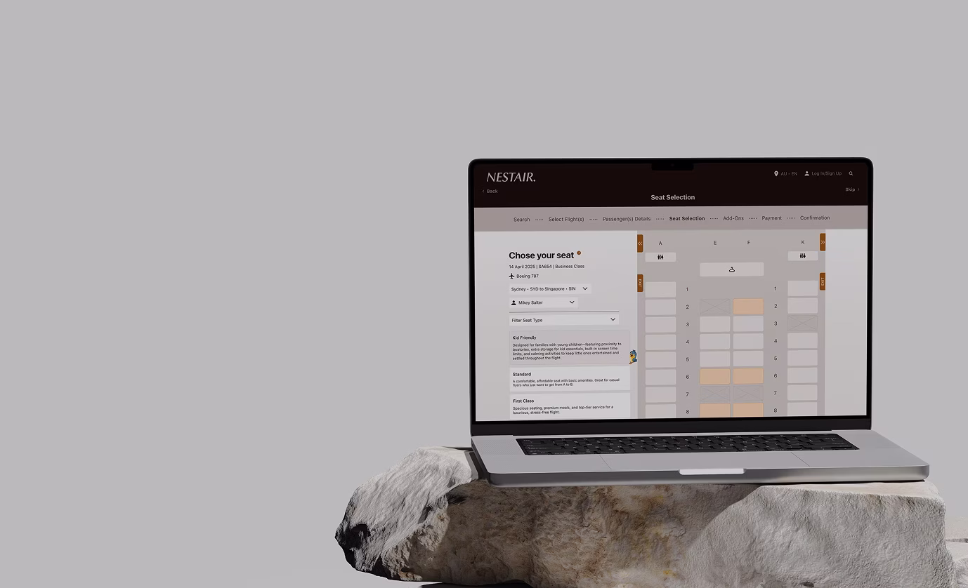
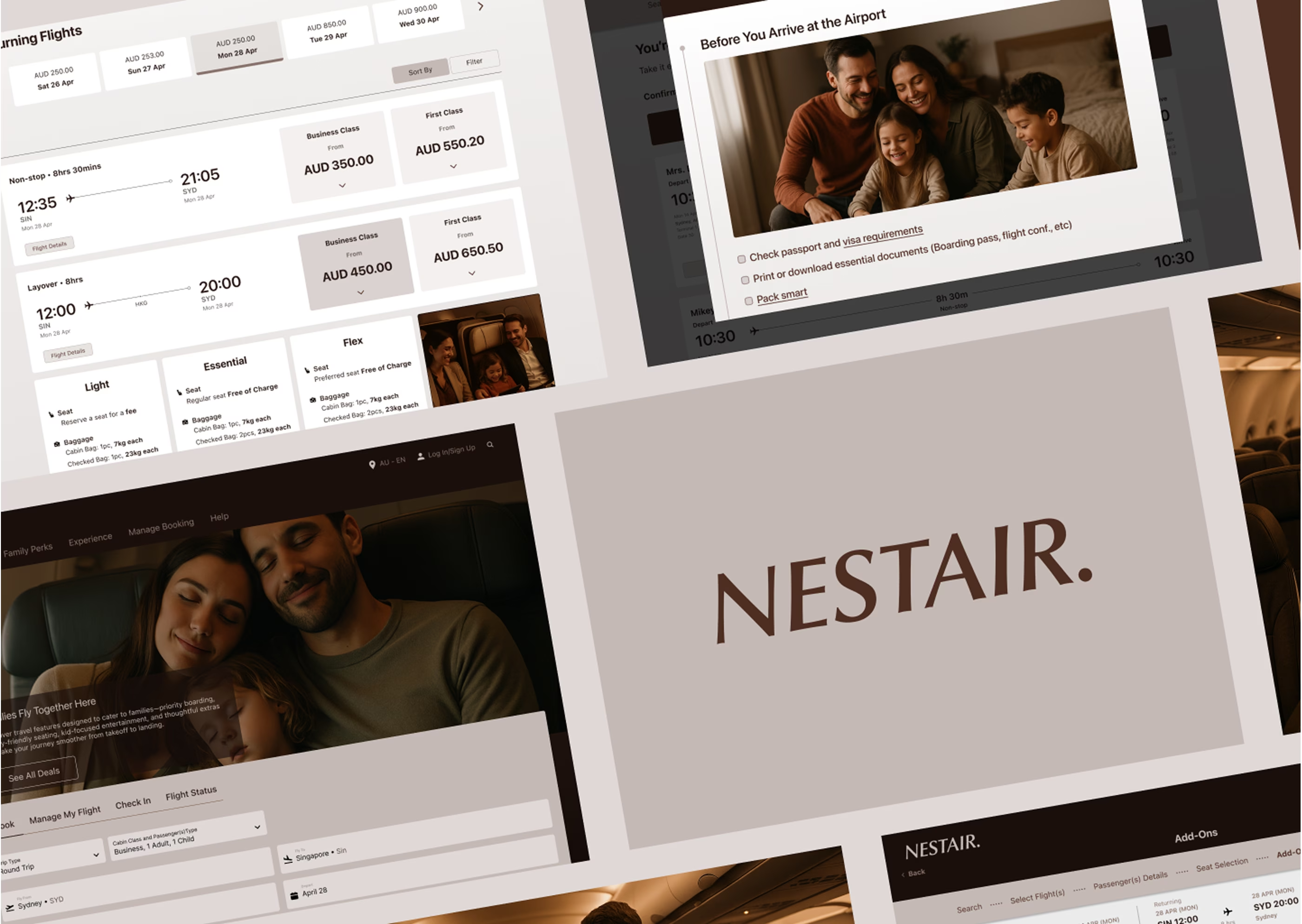
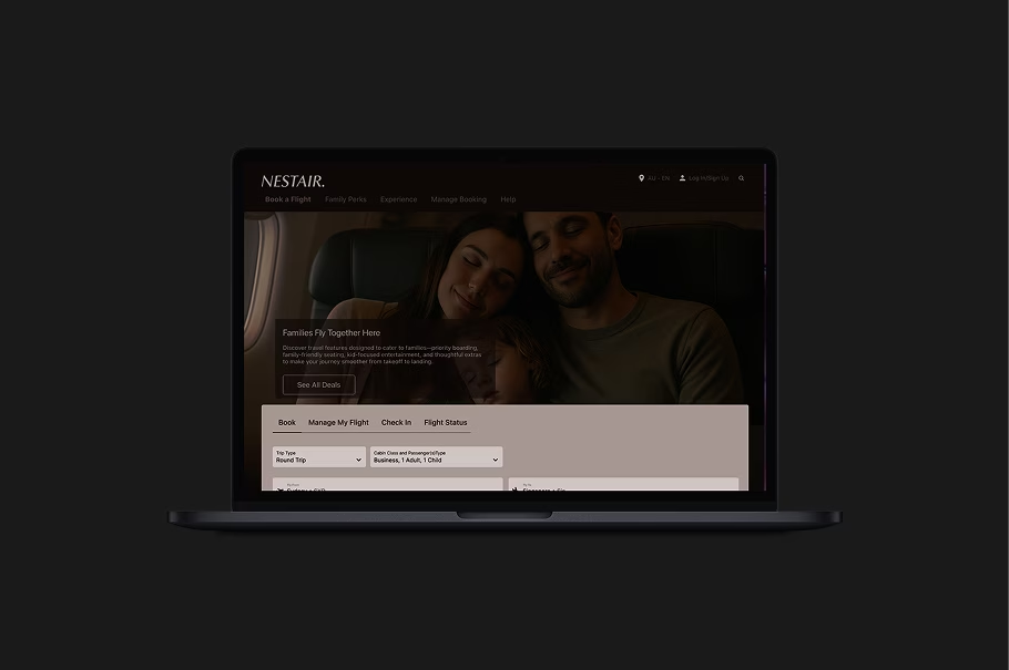
Nestair’s booking platform is designed with families in mind, offering personalized filters like “Kid-Friendly” and “Anxious Flyer Friendly,” transparent pricing, and an informative “What to Expect” checklist. It supports parents from planning to boarding, helping reduce stress and build confidence throughout the journey.
Design a solution that reduces stress, simplifies the process, and keeps parents informed throughout their journey.
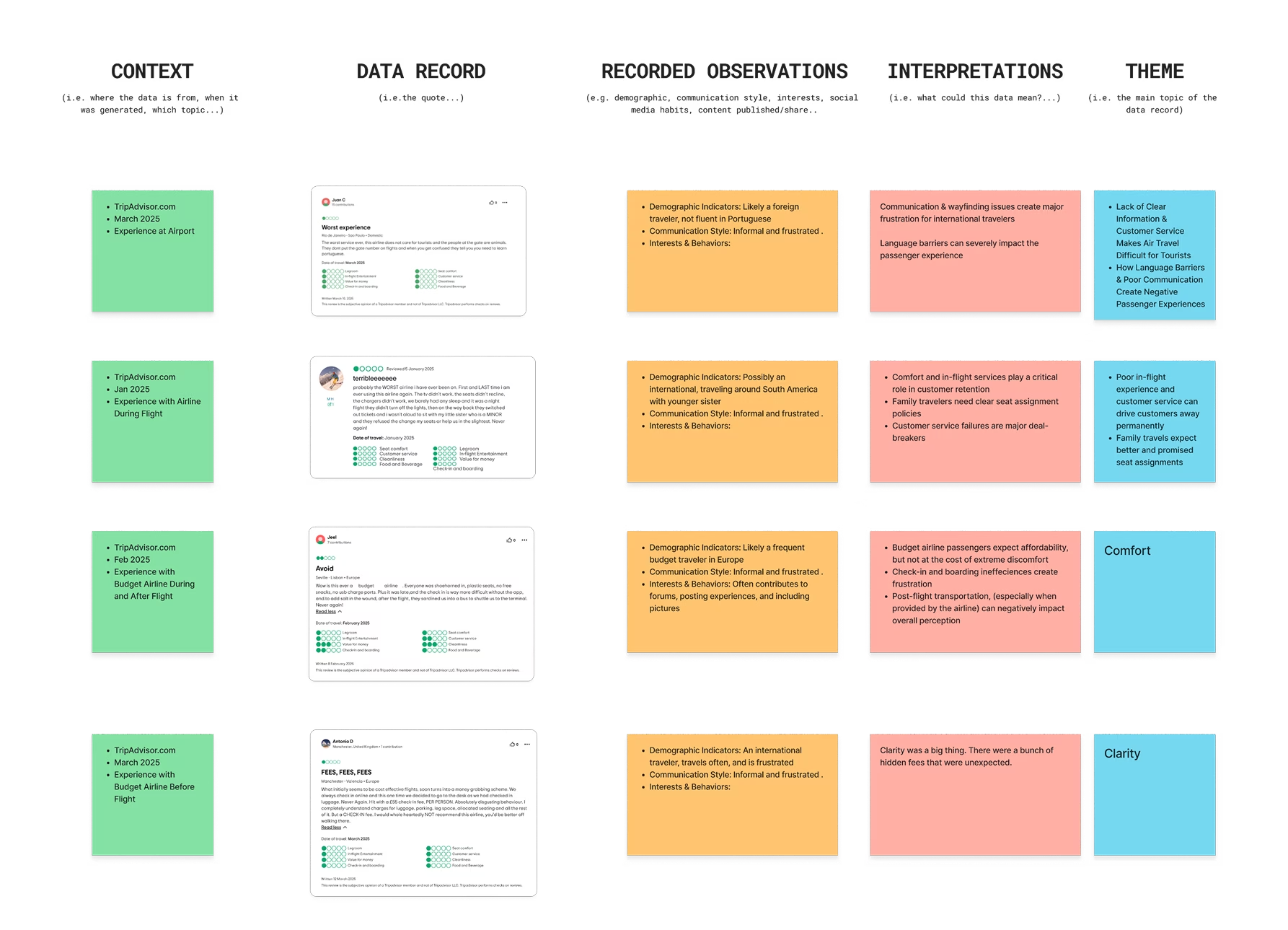
Before jumping into solutions, our group conducted thorough research to understand the root causes of stress for parents traveling with young children. We also examined how current airline systems attempt to address these challenges. Our discovery process included:
- Competitor analysis to benchmark existing airline offerings
- Online ethnography to observe real experiences and discussions
- Persona creation to empathise with different types of traveling parents
- "How Might We" statements to frame design opportunities
- Jobs-To-Be-Done (JTBD) mapping to define user motivations and needs
Through this research, we identified several recurring pain points, including:
- A lack of clear and accessible information for parents
- Limited child-specific features during booking and boarding
- Difficulty selecting or filtering family-friendly seating arrangements
These insights shaped our design direction and clarified the experience gaps Nestair aimed to address.
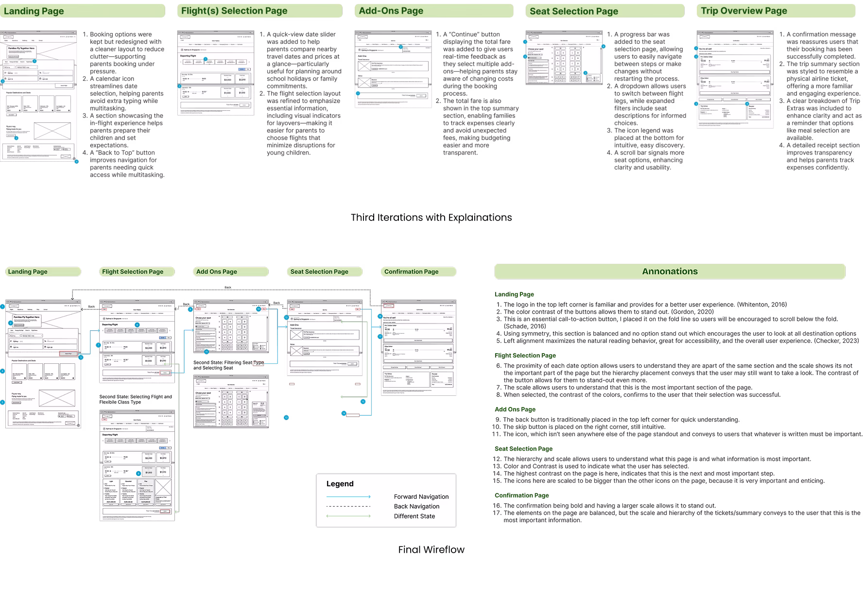
Following our discovery phase, I began with quick exploratory sketches in Procreate to visualise early layout ideas and user flows. These low-fidelity wireframes helped me explore different ways to address the key user needs we had identified during the discovery phase, included the features determined by from our “How Might We” statements.
Once I narrowed down a set of promising screens that aligned well with the brief, I began refining the designs, transitioning them into high-fidelity wireframes that reflected both usability best practices and brand direction. These wireframes laid the foundation for the next steps.
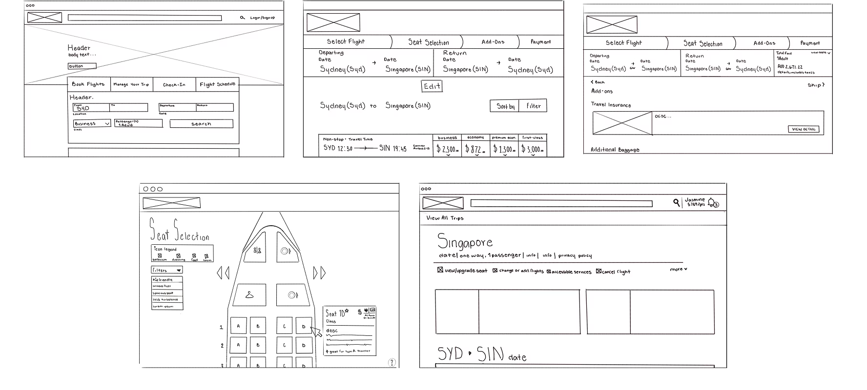
I translated my initial concepts into low-fidelity wireframes using Balsamiq, where I began iterating on the design based on peer feedback and insights from early testing. These quick cycles allowed me to validate layout decisions and ensure alignment with design principles such as usability, consistency, and accessibility.Over the course of three iterations, I refined elements like navigation clarity, button hierarchy, and content grouping. Once confident in the direction, I created a final wire-flow to visualise the complete user journey and ensure smooth transitions across screens. This flow served as the blueprint for high-fidelity prototyping and testing.
Although formal user testing was not a required component of this project, I chose to conduct informal usability testing with a small group of friends and classmates. I asked each participant to interact with the prototype and walk through key user tasks, such as booking a flight with a child or locating family seating options.From these sessions, I gathered valuable feedback on areas such as:
- Clarity of labels and icons
- Ease of navigation
- Visibility of child-specific features
This feedback led to several small but impactful design refinements, including adjusting button placement, improving text hierarchy, and adding microcopy to support user understanding. These changes helped enhance the usability and accessibility of the overall experience, especially for time-pressured or distracted parents.While not a large-scale test, this lightweight approach allowed me to ground my design decisions in real user input and continue to iterate with confidence.

To complement my usability testing, I conducted a heuristic evaluation using Nielsen’s 10 usability principles. This allowed me to assess the prototype from a usability perspective and identify any friction points early in the design.Key heuristics evaluated included:
- Visibility of system status – ensuring users receive timely feedback (e.g., confirmation after seat selection).
- User control and freedom – making it easy to undo or modify actions during booking.
- Recognition over recall – using consistent icons and labels throughout the interface.
This heuristic review led to additional refinements that improved consistency, reduced cognitive load, and aligned the product more closely with UX best practices.
Through iterative testing and platform-specific design, Nestair successfully addressed the unique challenges faced by parents traveling with young children. The desktop experience focused on clarity, ease of use, and stress reduction, reflected in positive user feedback. Participants reported increased confidence in navigating travel with children, a smoother booking process, and appreciation for features like family-friendly seating filters and clear informational prompts. While further testing with real parents would strengthen the outcome, early results suggest that Nestair effectively supports a calmer, more informed family travel experience.
If given more time, I would:
• Conduct formal usability testing with real parents to validate assumptions
• Explore additional accessibility features such as simplified modes or audio guidance
These next steps would help Nestair become a more robust, real-world solution for families in flight.
This project taught me that small design decisions can have a big impact, especially when users are already under stress. Key lessons include:
• The value of designing with empathy and edge cases in mind
• The power of collaboration, especially when working across multiple platforms
• How quick, informal feedback can still lead to meaningful iterations
Overall, Nestair pushed me to think beyond convenience and focus on creating calm, human-centered digital experiences.