Caper
Caper Byron Bay is a festival website redesign aimed at enhancing user engagement, streamlining the experience, showcasing Byron Bay's unique cultural offerings, and increasing the number of attendees. This was a solo project undertaken as part of my degree program at the University of New South Wales.
Festival-goers struggled to find clear, engaging information about events, schedules, and ticketing. Without a consistent digital identity, the festival lacked discoverability and failed to capture audience excitement. Way finding was a major issue, and the site’s flow needed simplification to reduce friction and keep users engaged.
A responsive digital platform and brand identity that made the festival easier to discover, navigate, and enjoy. The website flow was simplified to improve way finding, while the visual system brought consistency across digital and print.
Interactive elements, such as an event schedule and playful branding helped capture audience excitement and create a more engaging festival experience.
Redesign the Caper website with a strong focus on clear site mapping, easy access to information, and impactful branding.
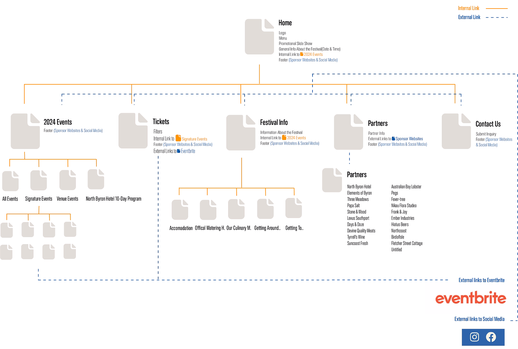
Before diving into my favorite part, designing, I first needed to complete the essential discovery phase. This involved conducting an in-depth brand and website analysis, mapping the site’s structure, researching precedent websites, and developing mood boards aligned with the brand identity and project goals.
Through this process, I identified opportunities for improvement within the original website and explored potential directions for the redesign. Creating the site’s original sitemap proved especially valuable, as it gave me a clear view of the structure and highlighted areas that needed refinement.
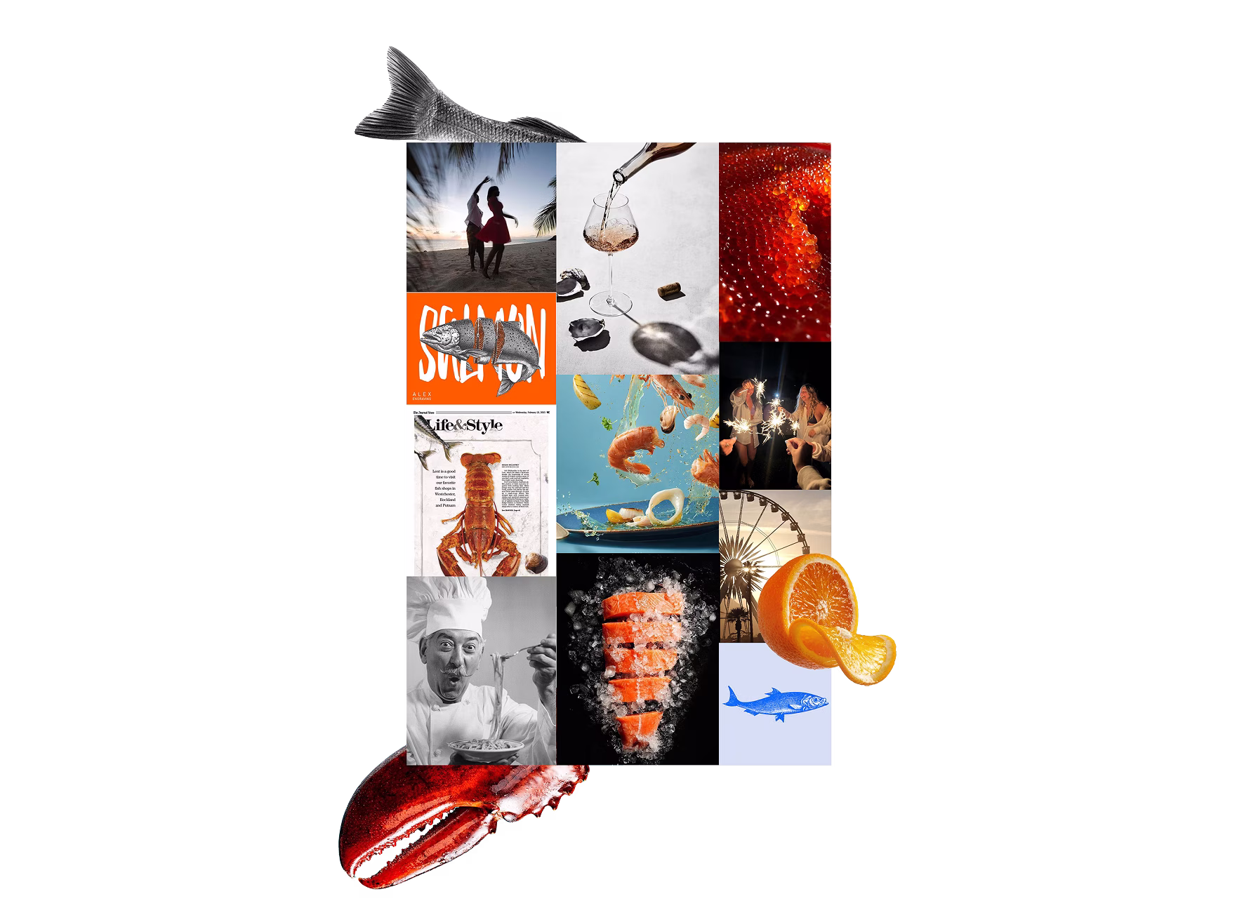
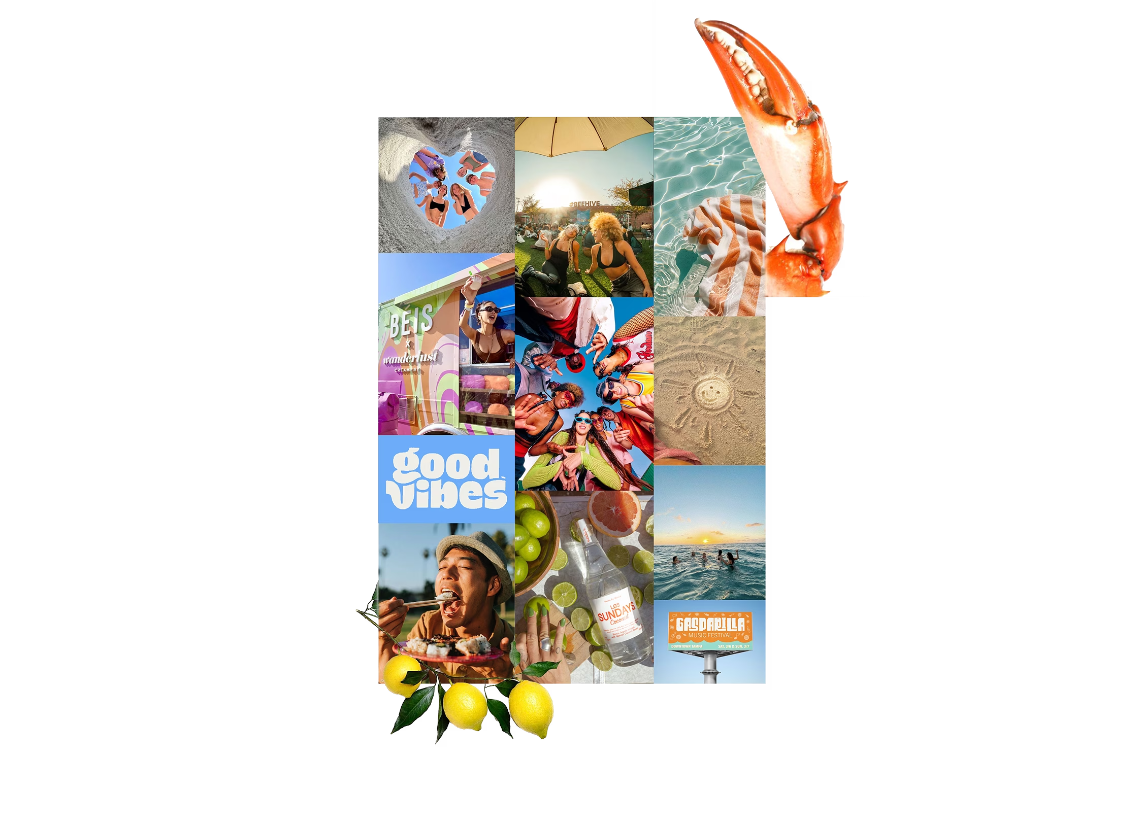
To explore visual direction, I created mood boards that captured the festival’s personality and guided design decisions for the redesign. To the left is an example mood board, which illustrates the keywords and imagery used to shape the site’s playful yet cohesive identity.
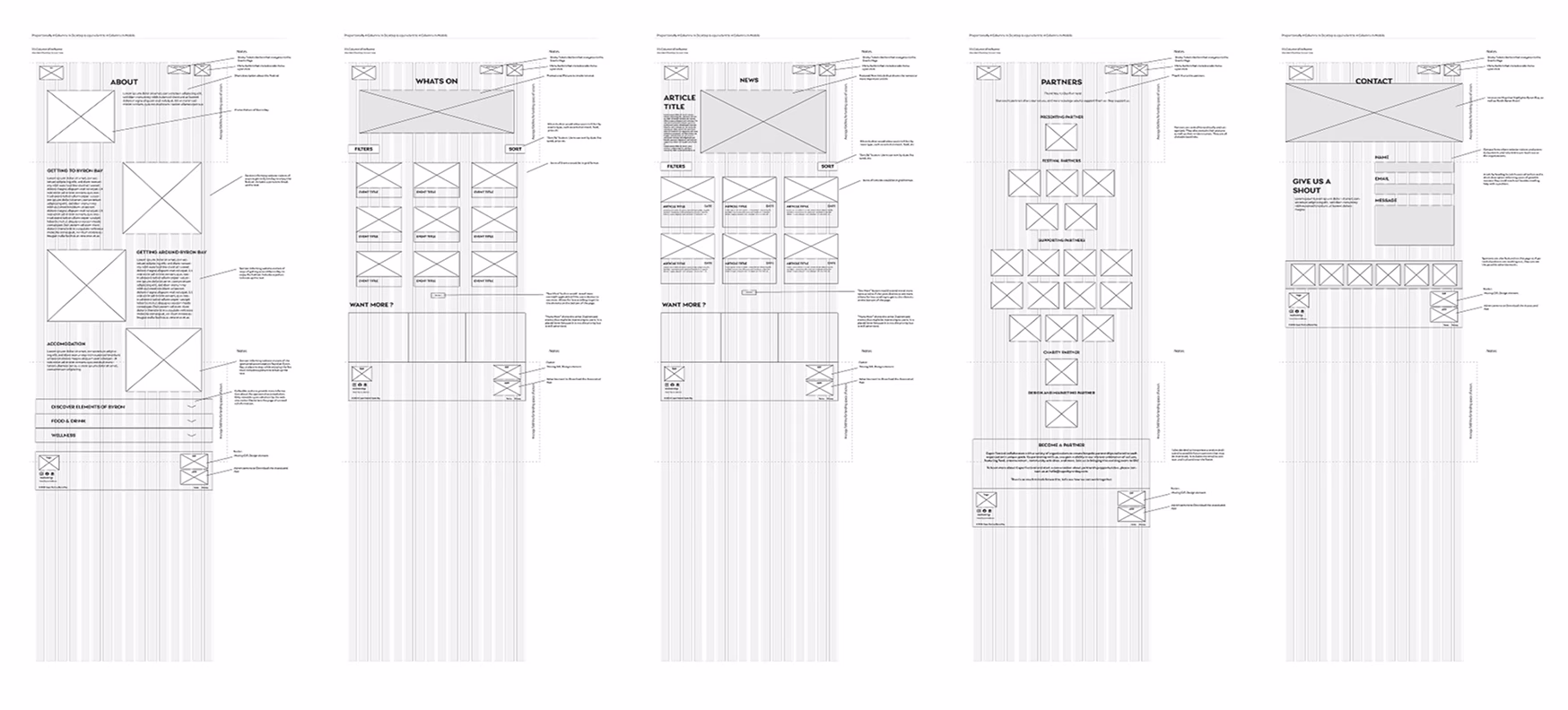
After defining the visual direction, I began sketching wireframe concepts using a 16-column grid. I started with quick explorations in Procreate, then translated them into Adobe Illustrator to create low-fidelity wireframes that presented the structure more clearly.
Once I selected a direction, I refined the homepage into a higher-fidelity design, then extended the system with five additional low-fidelity wireframes for the remaining pages. This stage gave me the opportunity to test early navigation flows and fine-tune layout decisions before moving into full design.
Designing the Ticketing Journey
I mapped the user flow for the “Get Tickets” pathway, focusing on the journey from clicking the button to completing a purchase through Humantix. The flow outlined each key step: selecting an event, choosing ticket options, entering payment details, and receiving confirmation.
By mapping this process, I ensured a smoother, more intuitive ticket-buying experience that minimized friction and guided users seamlessly from start to finish. This approach not only improved usability but also supported the festival’s business goal of increasing ticket sales and engagement.
Establishing a Cohesive Style Guide
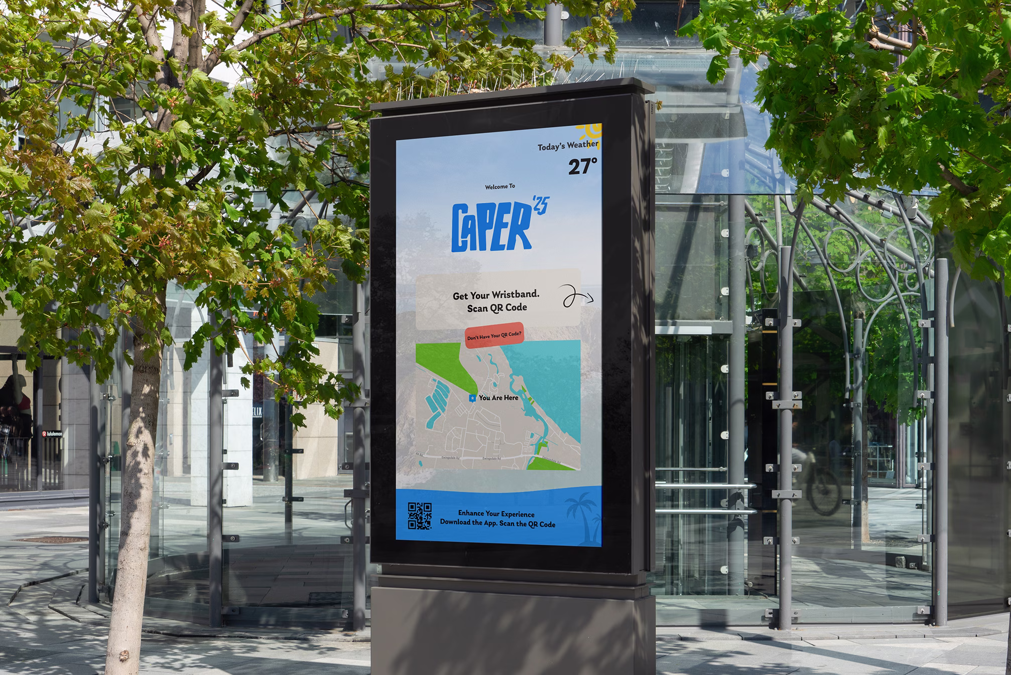
To maintain consistency across the redesigned website and future touch points, including an event kiosk, I created a style guide for the updated brand identity. The guide defined typography and usage rules, brand colors, interaction patterns, and key design details, ensuring the experience felt cohesive, recognizable, and true to the festival’s personality.
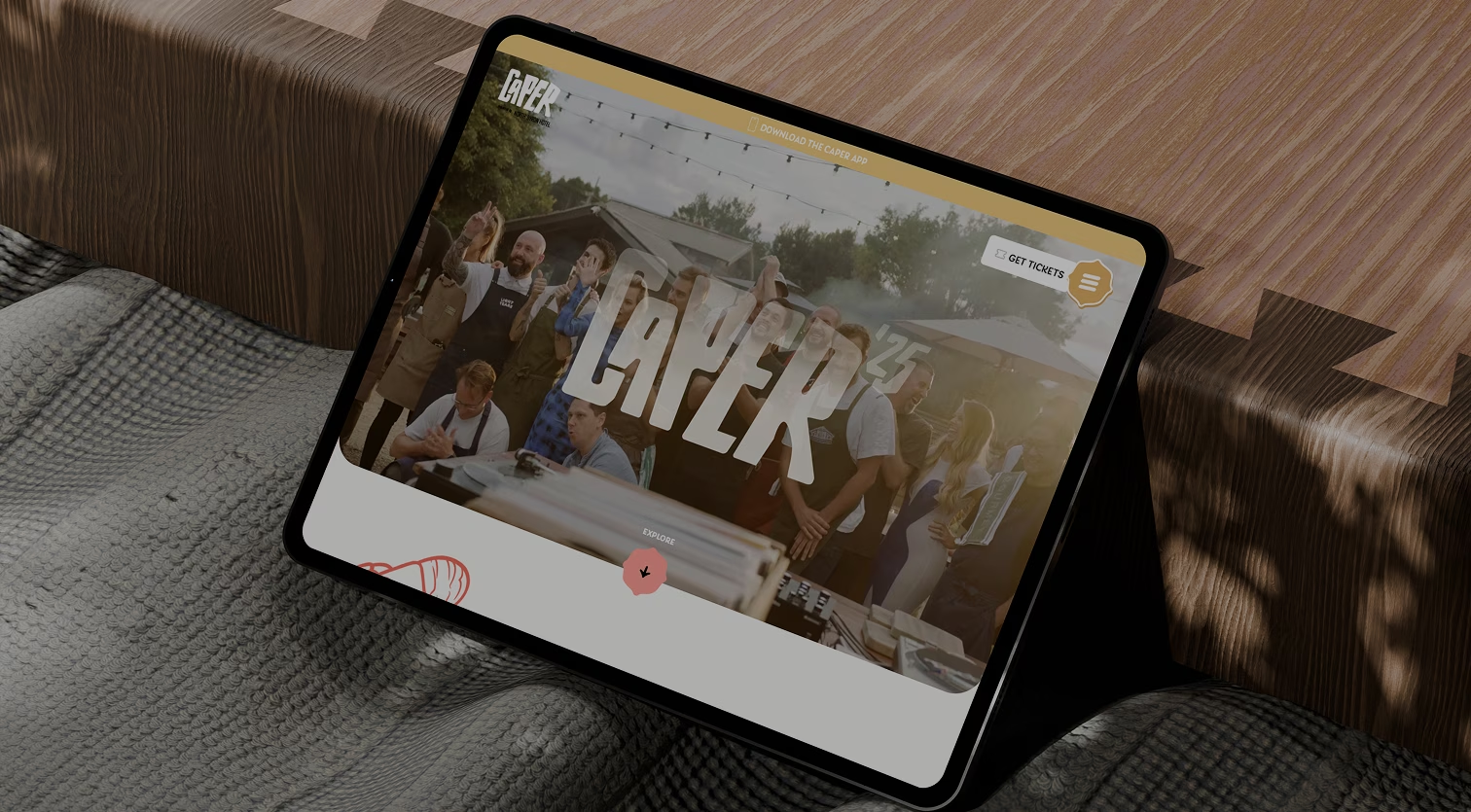
Iterating the Homepage
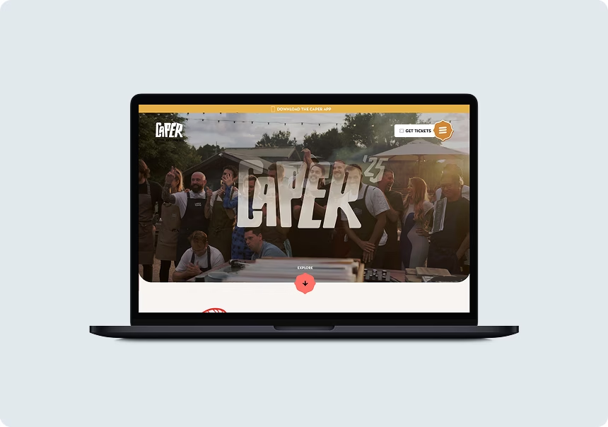
The homepage went through several iterations, as it serves as the opener, the user’s first impression of the festival and often the start of their journey. While the changes from the initial design to the final version were subtle, they had a meaningful impact on usability and engagement.
I added a header notification prompting users to download the Caper App and replaced the static hero image with one that more vibrantly represents the local area.
Content and layout refinements also played a role. I streamlined white space, renamed the “10-Day Program” to “What’s On” for clarity, and redesigned the event section to feel more dynamic and engaging. I also relocated the subscription section to a more prominent area to capture attention.
Finally, the footer was reworked with a bold new color scheme, prominently featuring event sponsors and incorporating Byron Bay graphics to enhance brand personality and visual appeal.
The final designs brought together the research, iterations, and branding work into a cohesive digital experience for the Caper Festival. The six key screens showcase the streamlined homepage, dynamic event listings, ticketing flow, and supporting pages, all aligned to the updated brand identity. Together, they create a playful yet intuitive experience that captures the festival’s energy while making navigation and ticketing seamless for users.

This project taught me the importance of grounding every design decision in clear reasoning. By considering natural eye movement patterns, I made more intentional choices around elements like logo placement and calls-to-action. Feedback throughout the process also pushed me to think beyond safe solutions and pursue more innovative, engaging outcomes.
Overall, this experience deepened my understanding of user behavior and strengthened my ability to defend design decisions with evidence, skills I plan to continue refining as I take on more complex, real-world projects.
If given more time, I would enhance the hero section with a video of past events to create a more immersive first impression. I’d also refine smaller details and finishing touches to further elevate the overall design.
Looking ahead, I’d love to see this design implemented with real user testing, tracking retention rates, monitoring CTA conversions, and gathering feedback to guide ongoing improvements. This would ensure the experience continues to feel fresh, engaging, and effective.